

Hammersmith — a large CRM system for restaurant chains
I worked on a large CRM system for a major restaurant chain. My team included a restaurant manager, a project manager, and a development team.
- Role
- Product Designer
- Team
- DesignerDevelopersManager
01 — Context and Problem
HammerSmith is a restaurant POS/back-office system designed for two different users: the manager (desktop, mouse, data-dense screens) and the cashier (touchscreen, minimal cognitive load, working under the pressure of guest flow). A mobile app for restaurant guests is also being developed in parallel. One system — two different modes, and that's the main design challenge of the project.
02 — Objective
Design a cohesive interface for both scenarios using a unified component language — not two separate products, but one system with two adaptive layers — and solve specific module problems as they are identified.
03 — Choosing the Visual Direction
Before moving on to individual modules, we needed to define the overall visual language of the system. A POS interface is a working tool used under stress: during shifts, with high accountability for every action. I proposed three concepts — the client chose the one that best fit the existing development component base.
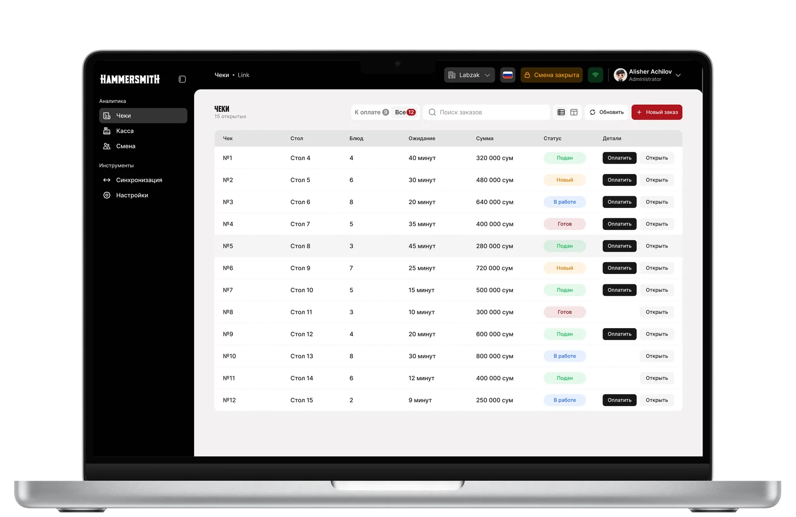
Option 1
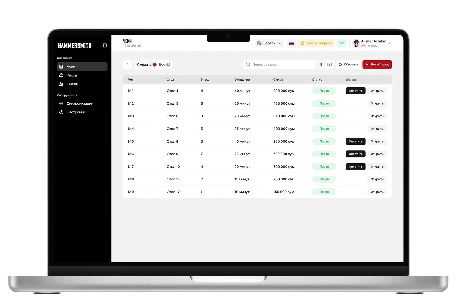
Option 2
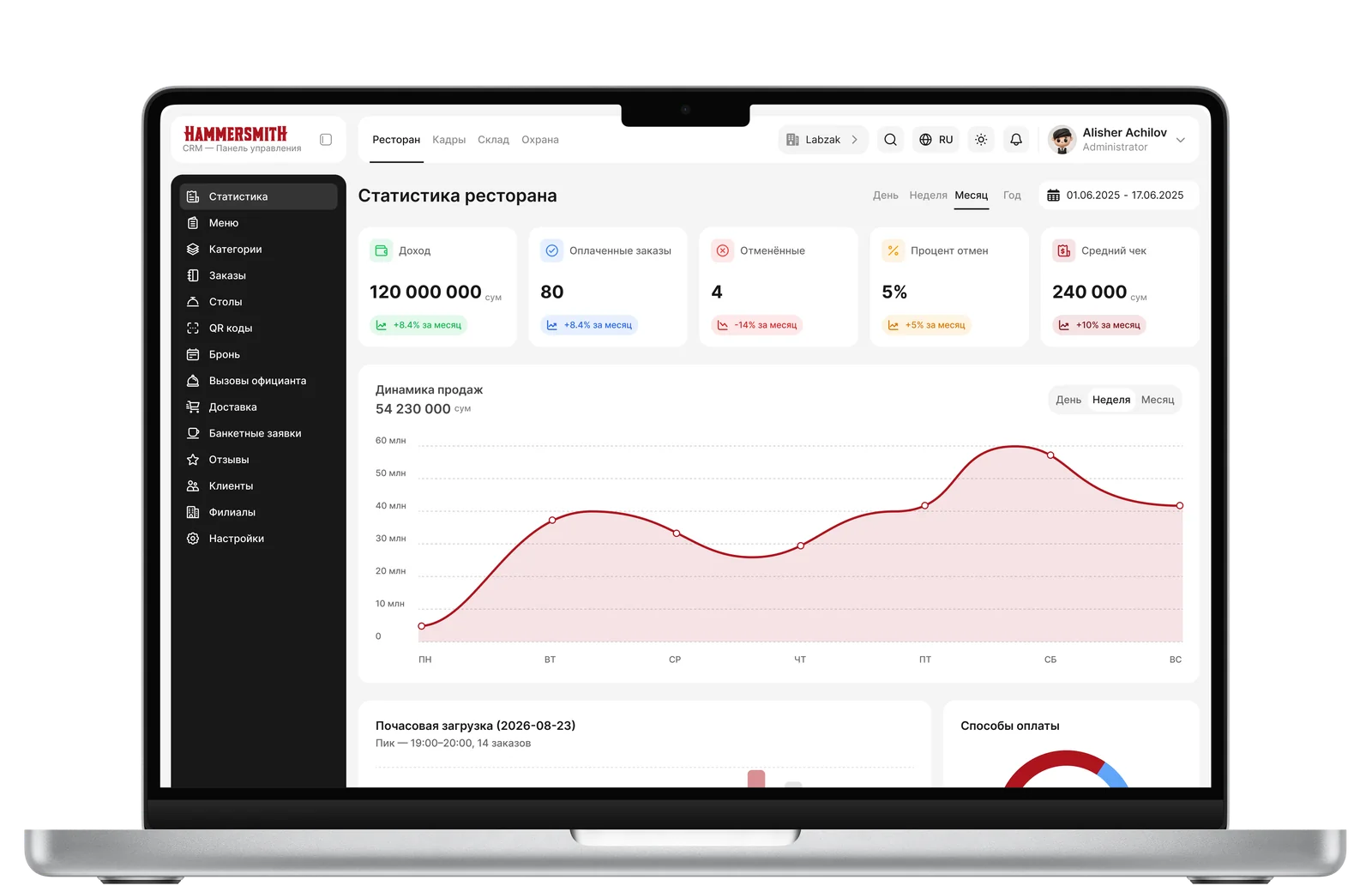
Option 3
04 — Process and Solutions
Menu
Before the content, the screen had three service rows in a row: a header with search, category tabs, and a full-width banner about dishes without IKPU codes — too much for a dense manager screen. We combined the header with search and tabs into one row, replaced the banner with a compact clickable chip warning (“17 without IKPU”) in the same row as the tabs, and switched tabs from touch to mouse sizing.
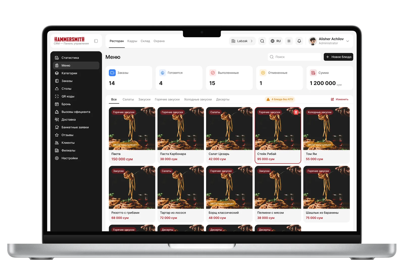
Menu
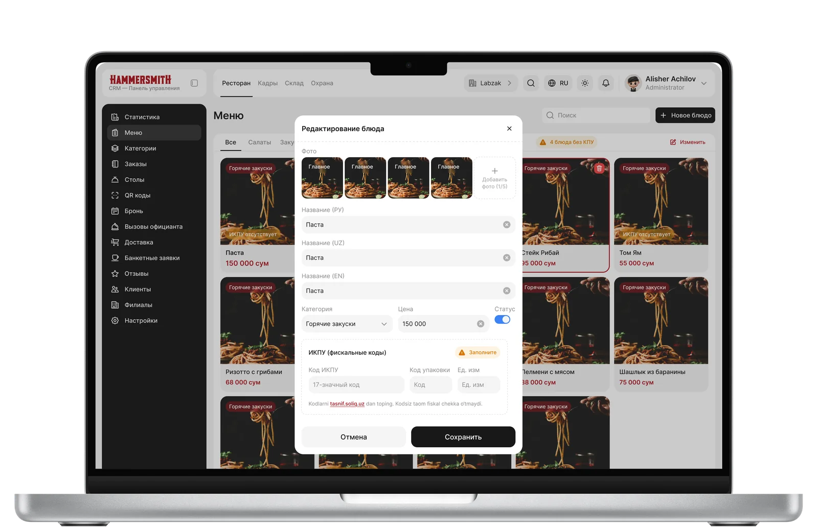
Dish Editing
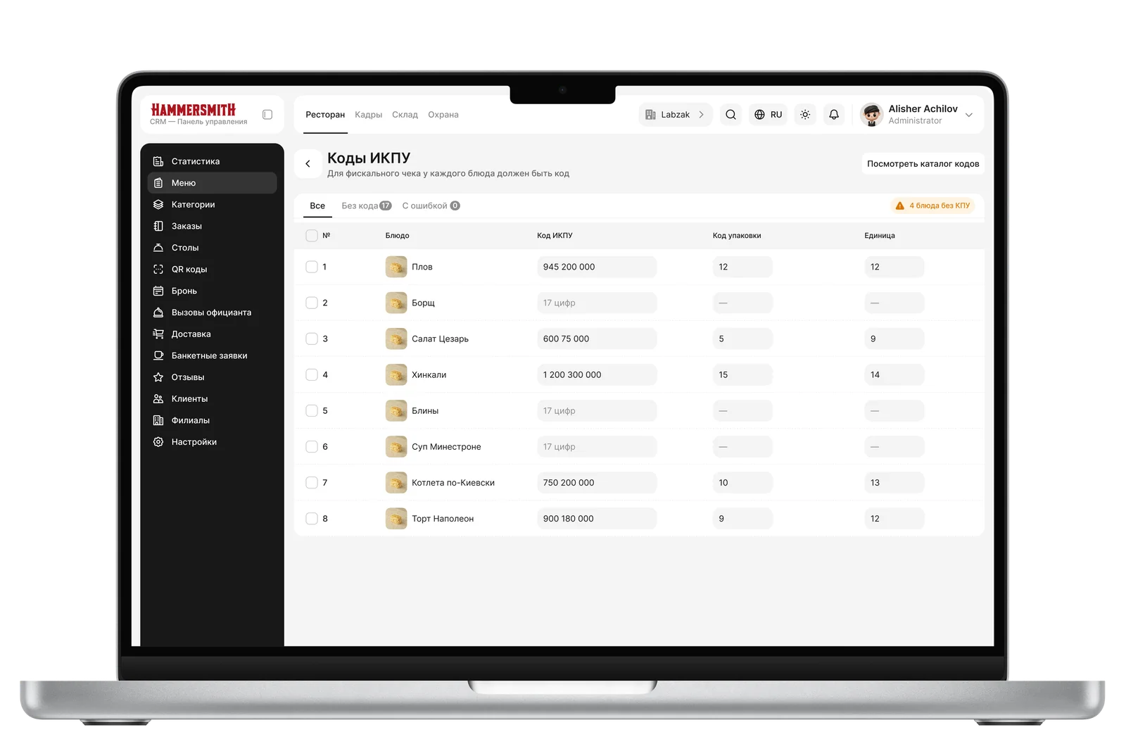
IKPU Codes
Orders
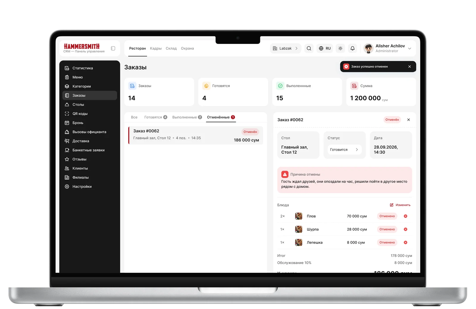
The list got its own scroll, and the panel got a natural height with a pinned action block at the bottom. The new order builder was single-column — dishes were added by clicking “+” without a visible cart or total. We replaced it with a two-panel layout: catalog with categories and search on the left, live cart with quantity and total on the right.
We designed a status → actions matrix: “Preparing” remains editable, “Completed”/“Cancelled” are terminal states with a “Repeat Order” button instead of editing. We also moved order cancellation to a separate modal confirmation with a structured reason — previously, the inline reason field visually conflicted with the item removal crosses.
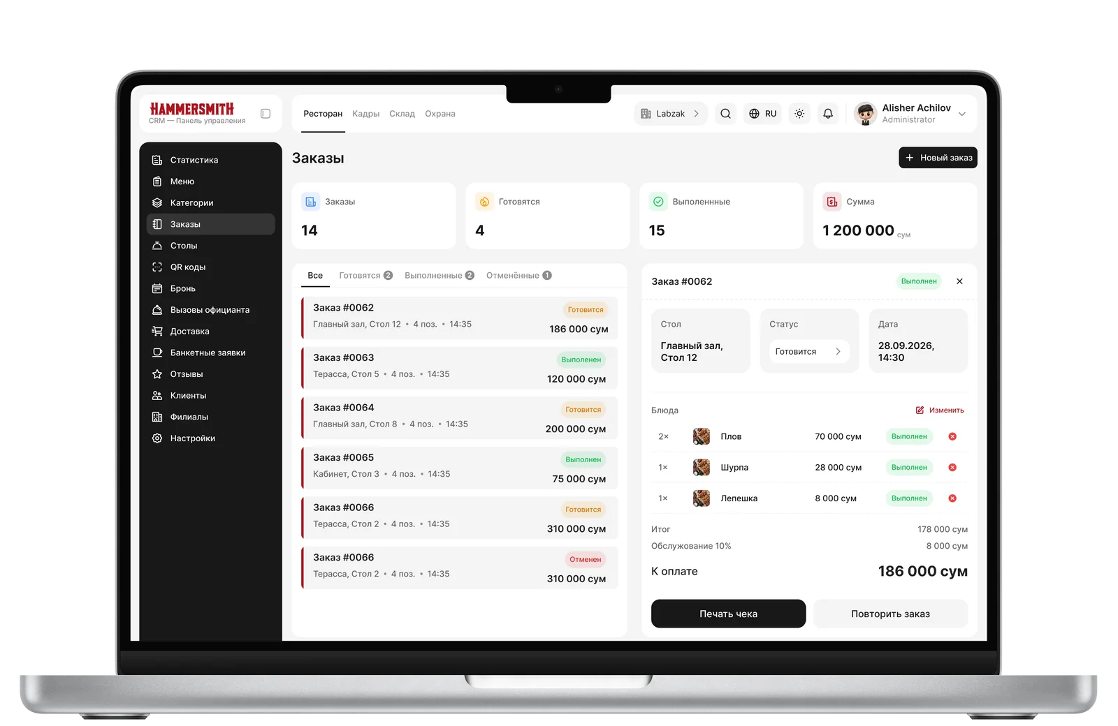
Orders
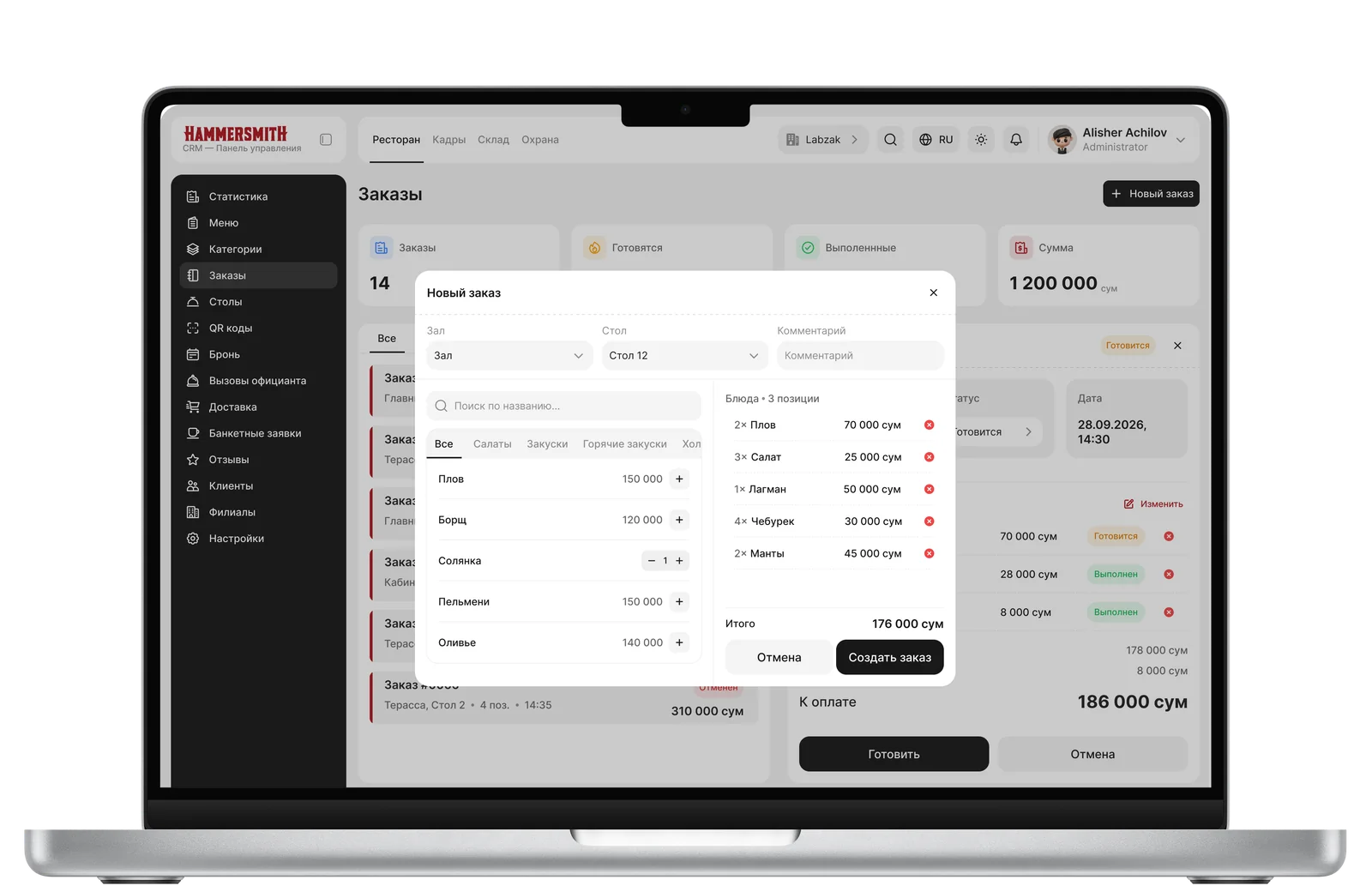
Adding
Orders Switching
Tables
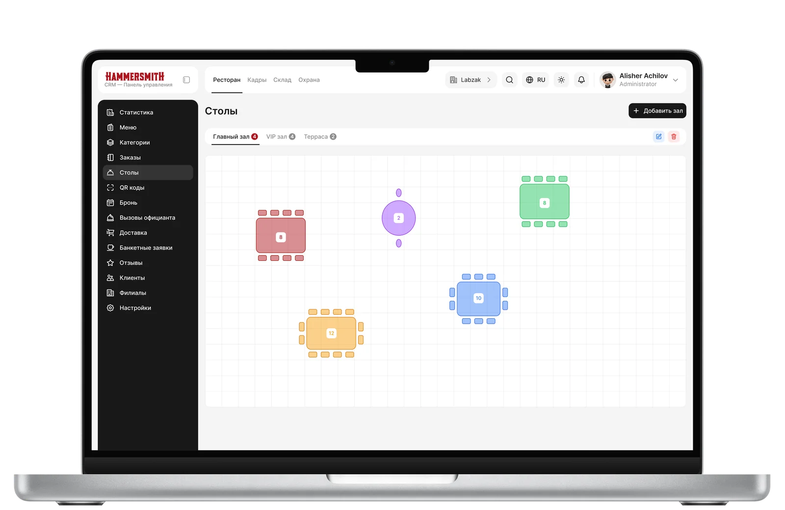
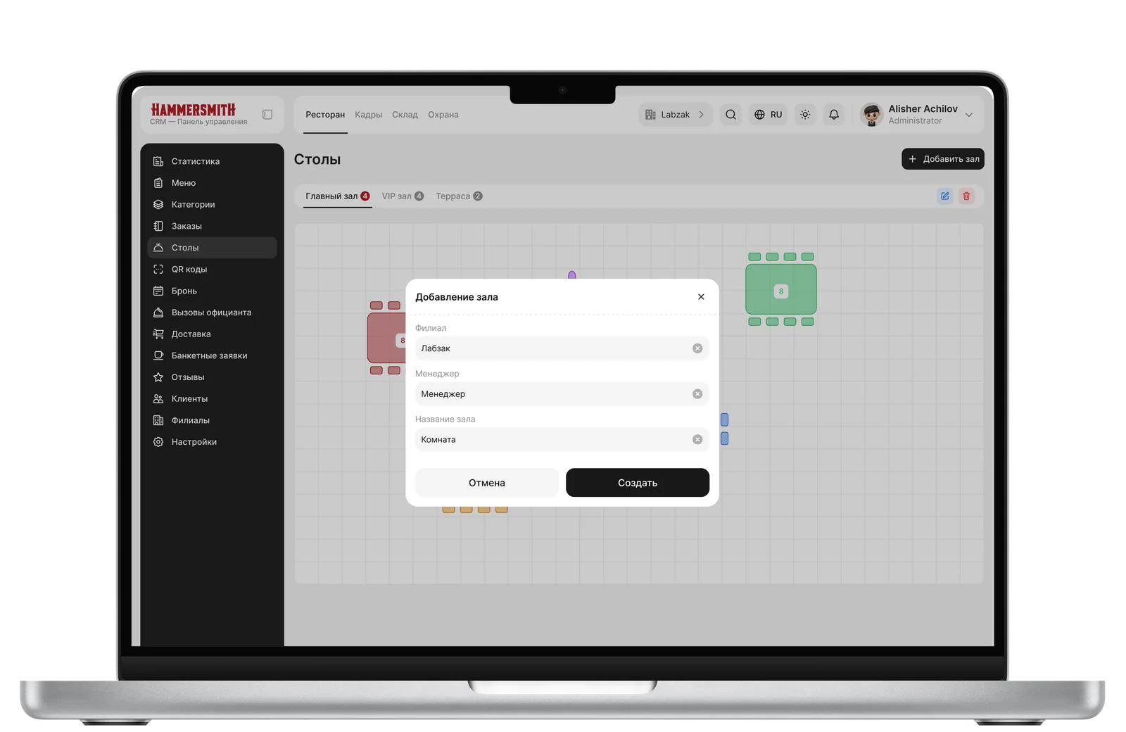
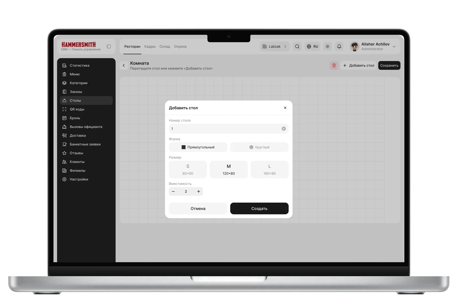
The most confusing section. Hall creation followed a “create first, name later” pattern. Plus data desync (badge showing “1”, but inside the hall — “0 tables”) and duplicated tools within the canvas editor: delete and align existed in both the left panel and the right panel, without being tied to the selected object.
Solution: a naming modal instead of create-before-name; the static left panel was replaced by a floating toolbar dependent on selection; alignment and object actions (Copy/Delete) were consolidated in the right properties panel, while the left panel was reserved solely for canvas-level tools.
Halls
Adding a Hall
Adding a Table
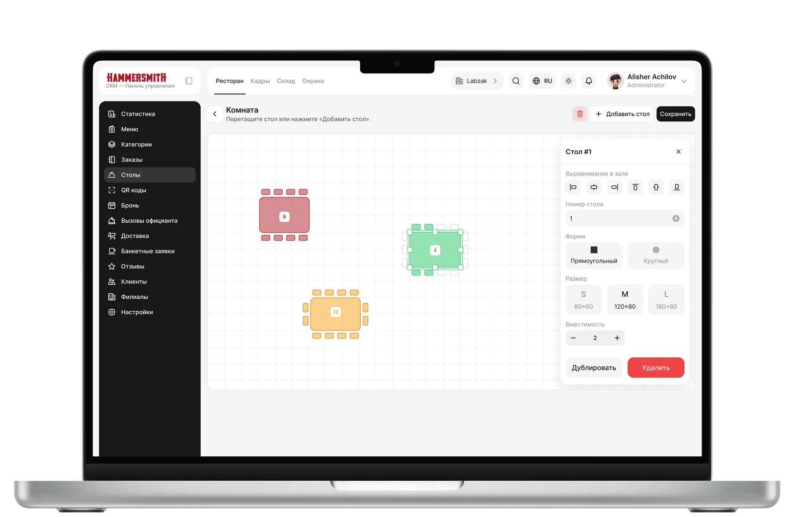
Tables
Customers, Waiters
We designed customer segmentation (VIP / Regular / New), a summary metrics block, a slide panel for quick customer preview, and a separate full customer card for working with the complete record.
Waiters — a module for calling a waiter to a table: each call is logged in a table divided into active and history, with other statuses throughout processing.
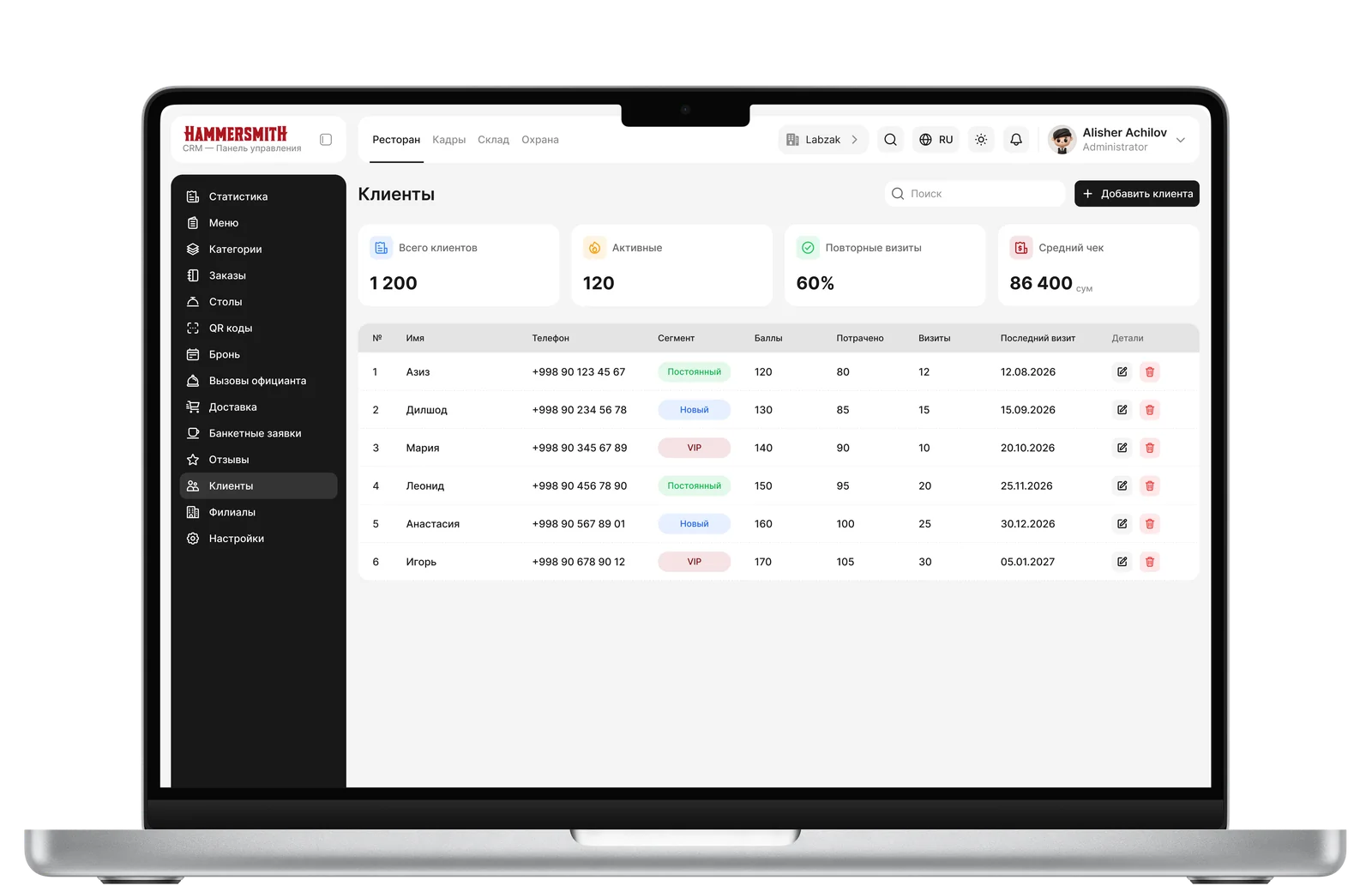
Customers
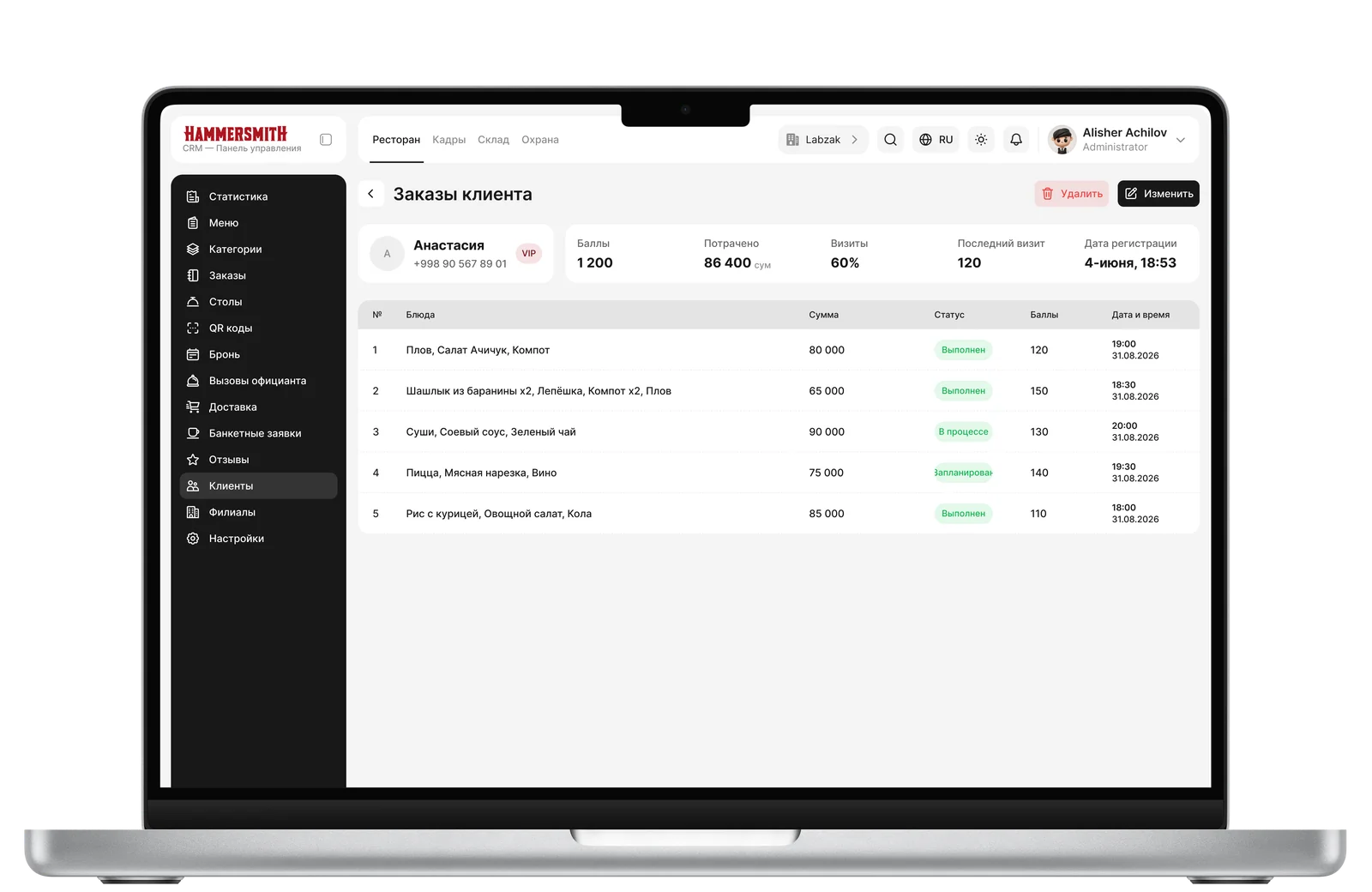
Customer History
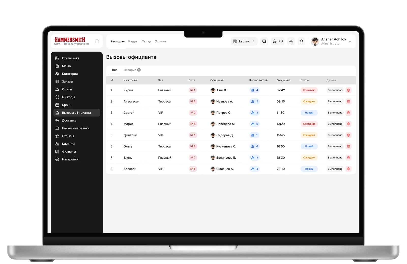
Waiter Calls
Reviews, Branches, QR Menu
Reviews — a redesign with a summary block (average rating + star distribution), a compact table instead of an overloaded one, truncation of long comments, and a slide panel for replying.
Branches — a block with a list of all chain branches.
QR Menu — menu QR codes generated separately for each branch.
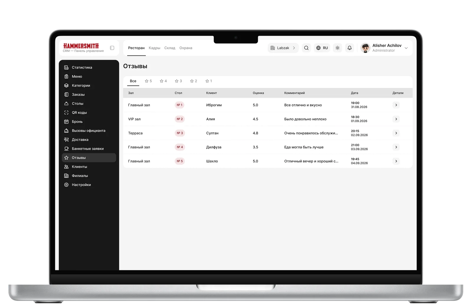
Reviews
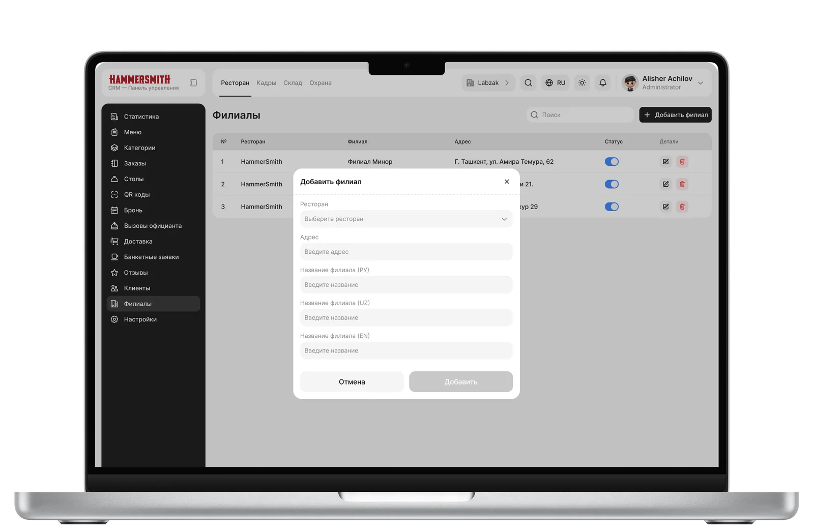
Branches / Adding
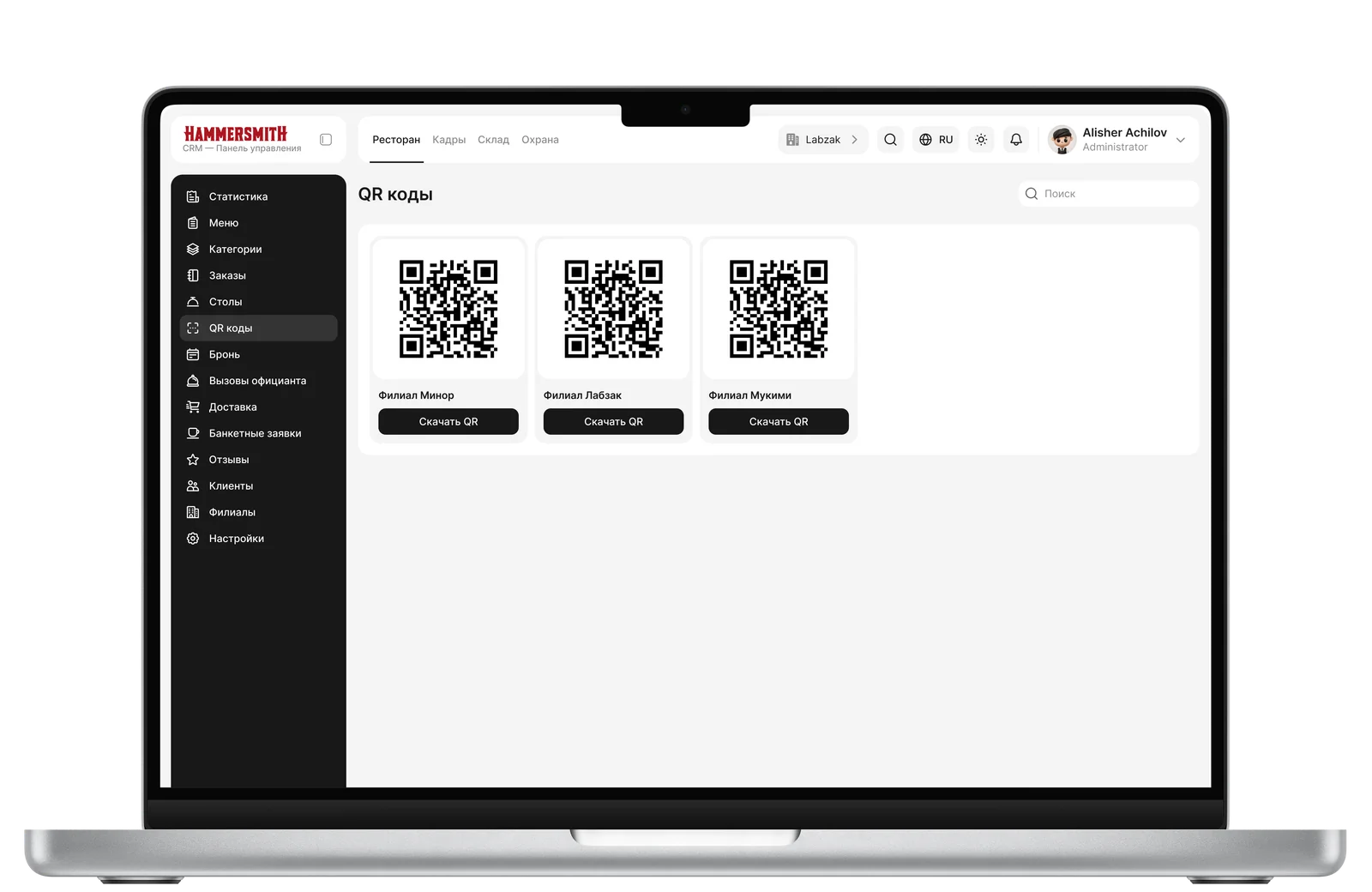
QR Menu
Categories, Reservations
Categories — dish categories that form the navigation in the Menu section.
Reservations — a table reservation module for guests at a specific time.
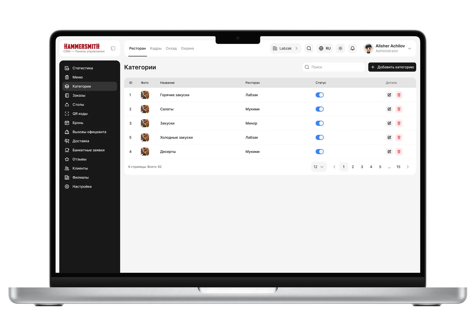
Categories
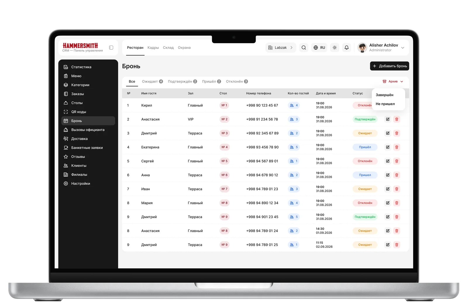
Reservation
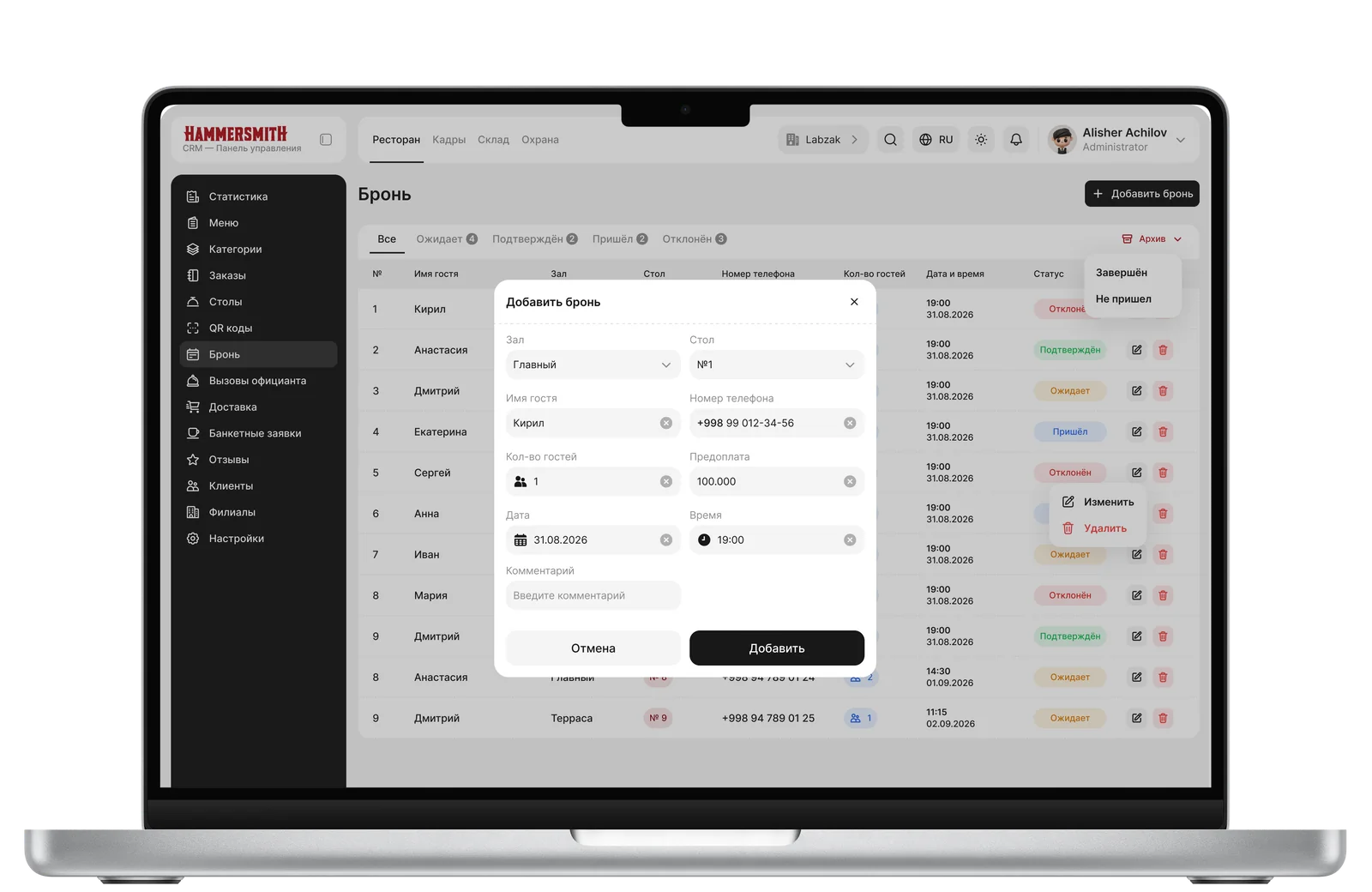
Adding a Reservation
05 — Results
At this point, the case study describes only a portion of the work done — less than half. In addition to the sections covered, three large system blocks (HR, Warehouse, Security) are still in the process of requirements clarification and design decisions.
The project is alive and continues to evolve: some of the solutions described above have already been established as patterns for the entire system (naming modals instead of create-before-name, floating property panels instead of static ones, separation of canvas-level and object-level tools) — and will be applied when refining the remaining sections, rather than being reinvented for each one.