

Uzum Bank — how I Rethought a Major Bank's Filter Analysis Scenario
As a product designer, I redesigned the transaction filtering scenario at Uzum Bank — one of the largest online banks in Uzbekistan. I conducted 8 interviews, analyzed competitors' best practices, and designed a filter
- Role
- Product Designer
- Team
- DesignerMentor
01 — Context
Uzum Bank is one of the largest online banks in Uzbekistan. In the app, transactions can only be sorted by date — without categories, amounts, or periods. Users cannot understand the structure of their spending or quickly find a specific payment.
02 — Goals

Business Goals
- Retain users
- Increase product value
- Improve NPS
User Goals
- Quickly find a transaction
- Control budget
- Compare periods
03 — Research
I conducted 8 qualitative interviews with online banking users. The main question: how they analyze their spending and what prevents them from doing so in the app.
Three key insights
Users rely on third-party apps (Excel, notes) — the bank doesn't cover the task
Searching for a single transaction takes 2–5 minutes with a large number of operations
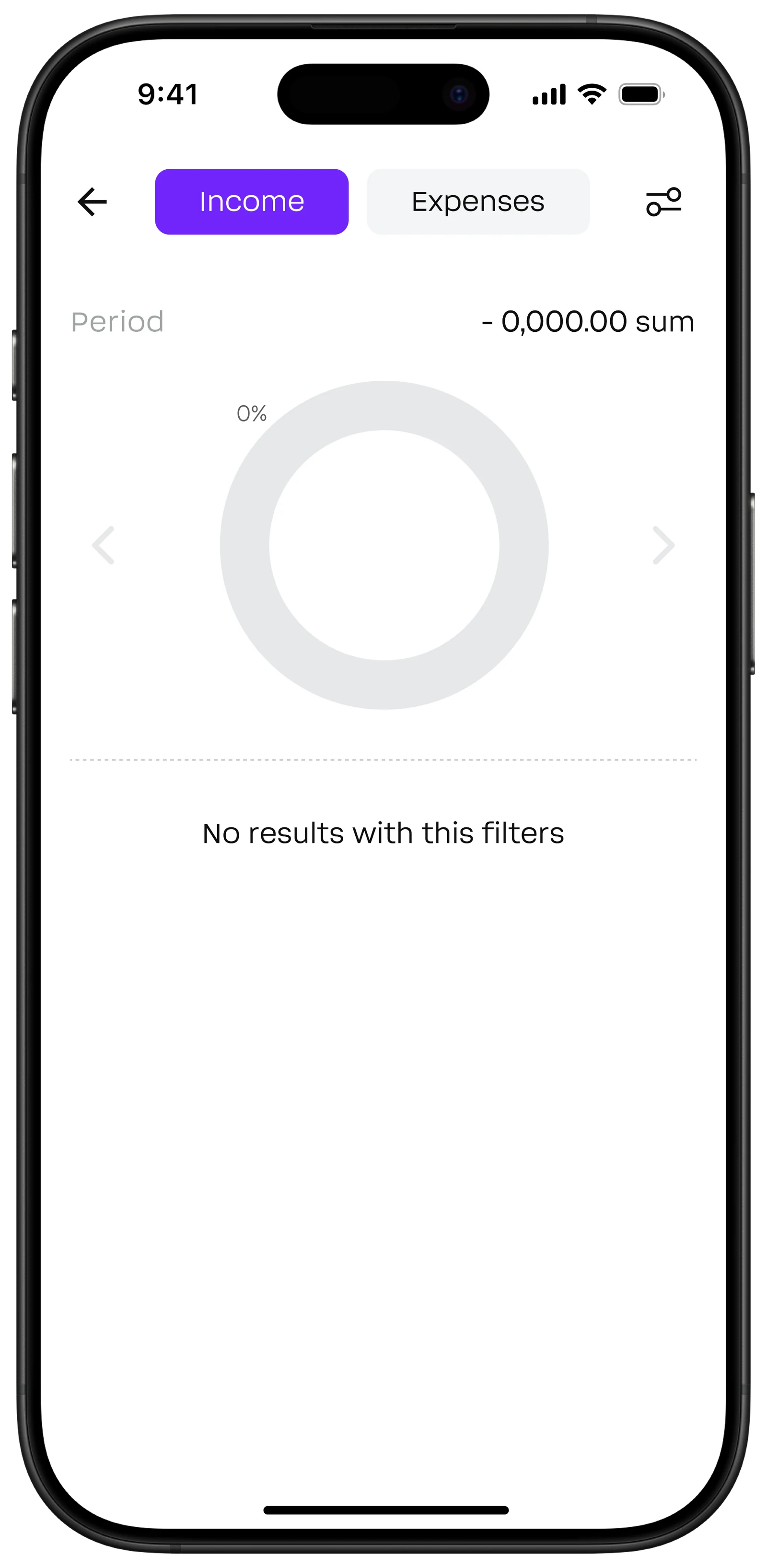
Users want to see a total for a period, not a list
04 — Best Practice
I analyzed filters in Sber, T-Bank, and VTB. In all three, filtering is placed in a separate scenario. All of them offer spending categories with icons, period selection via calendar, and visualization. I took these patterns as a foundation and adapted them for Uzum Bank.
05 — Prioritization and User Flow
To evaluate hypotheses, I used ICE Score: Impact · Confidence · Ease.
The final 3 solutions had the best value-to-complexity ratio.
Three winners
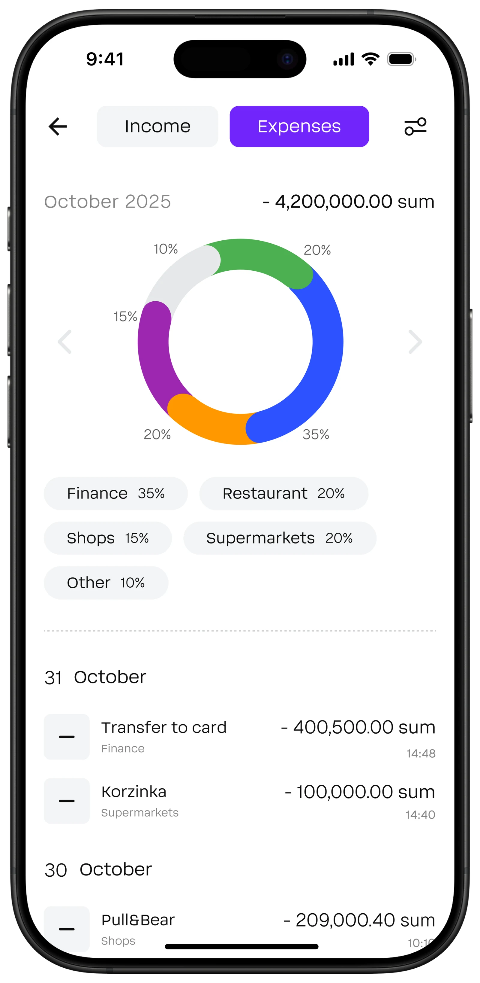
Spending and income chart — ICE: 1.5
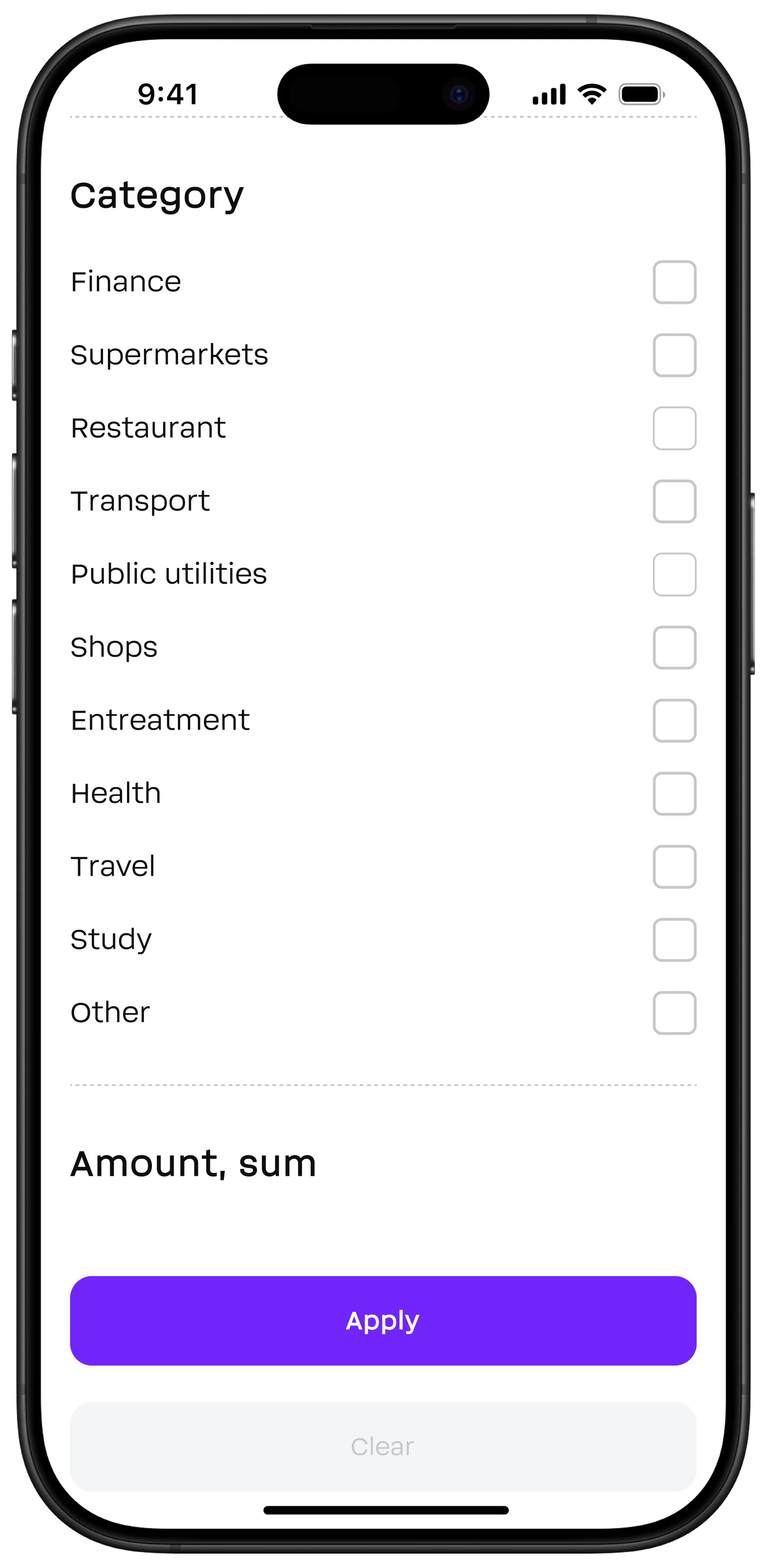
Transaction categories — ICE: 1.5
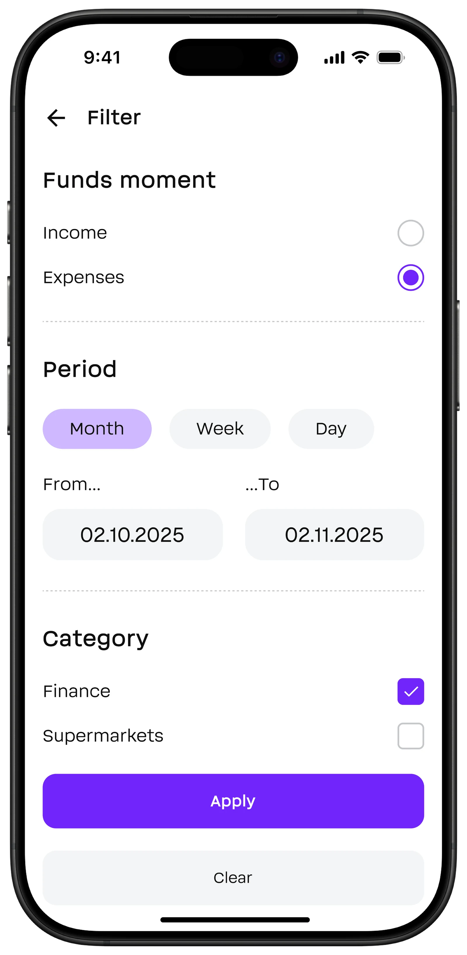
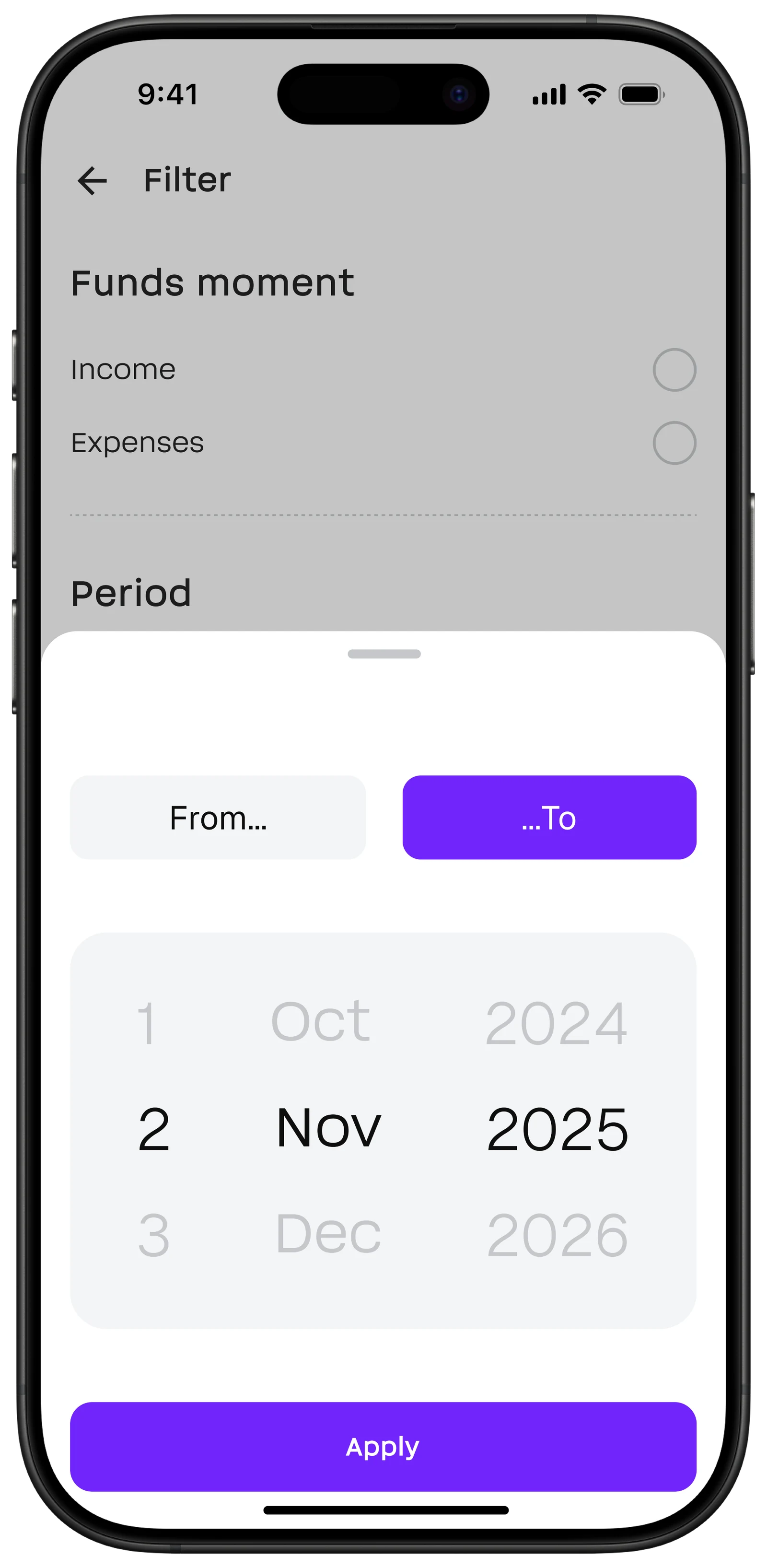
Advanced filter — ICE: 3
Before designing, I mapped out the flow: how the user opens filters, applies parameters, and sees the result.
06 — Design Result
Prototype
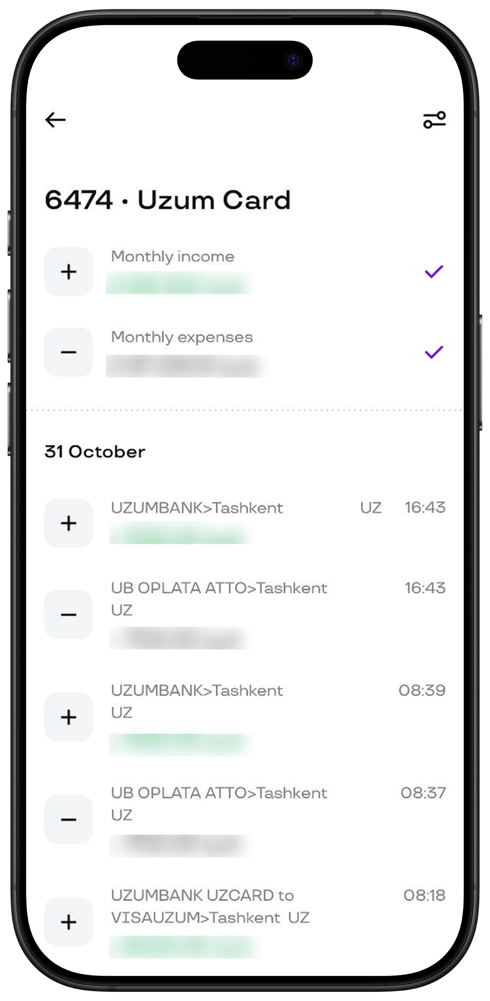
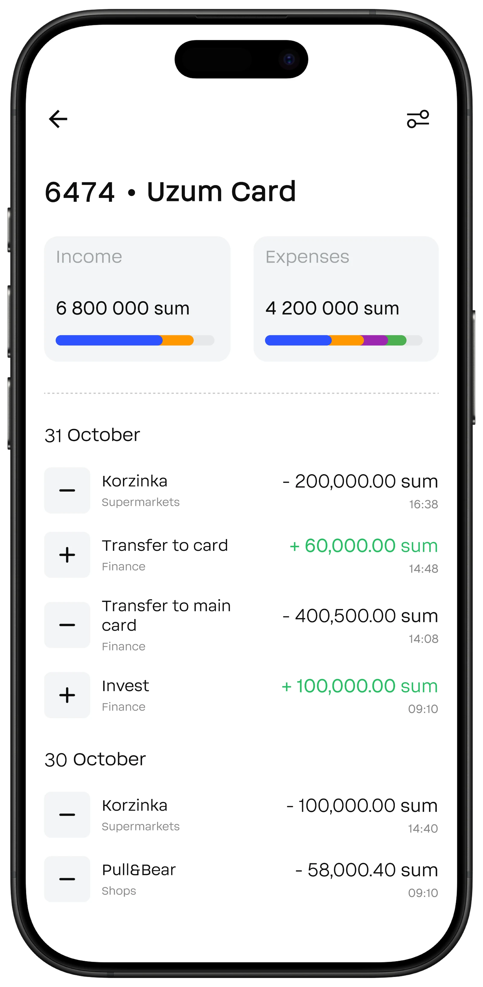
Before/After
Before
After
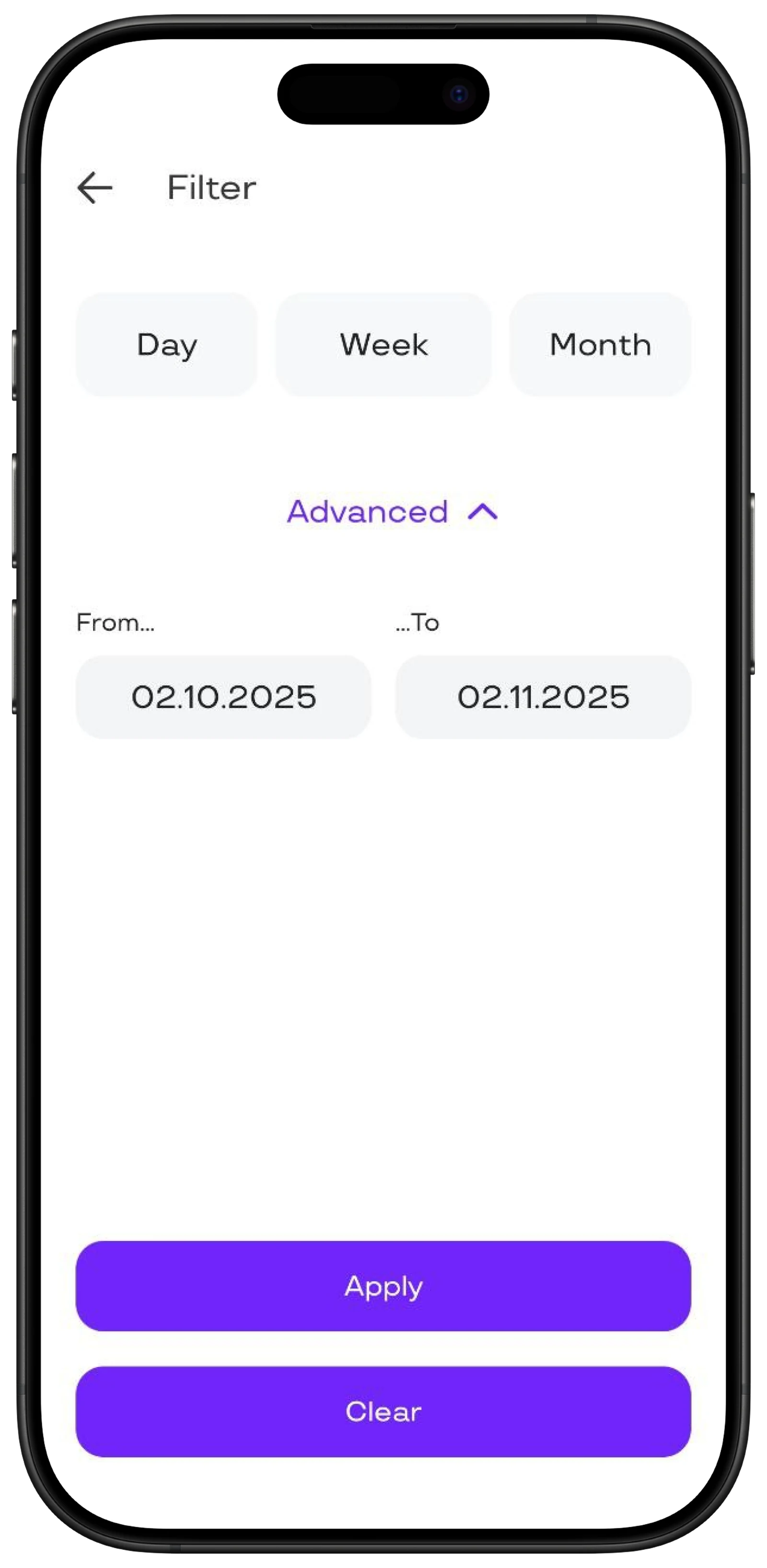
Before
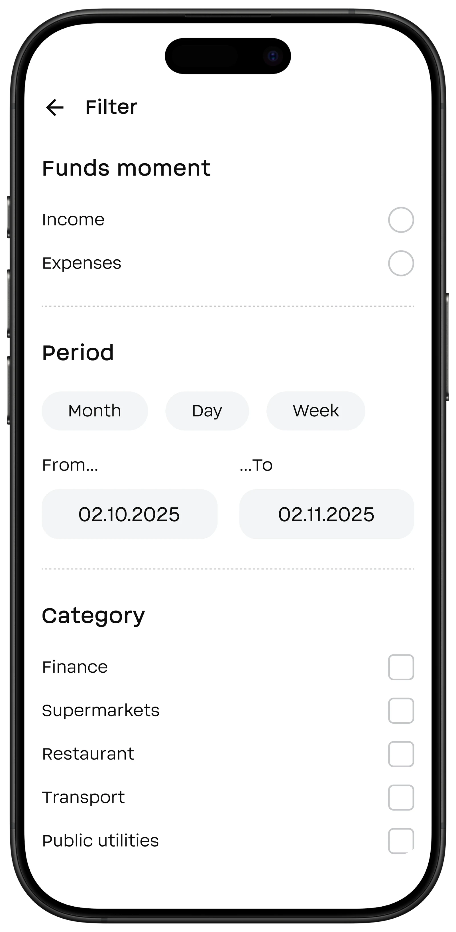
After
Hypothesis: spending and income chart
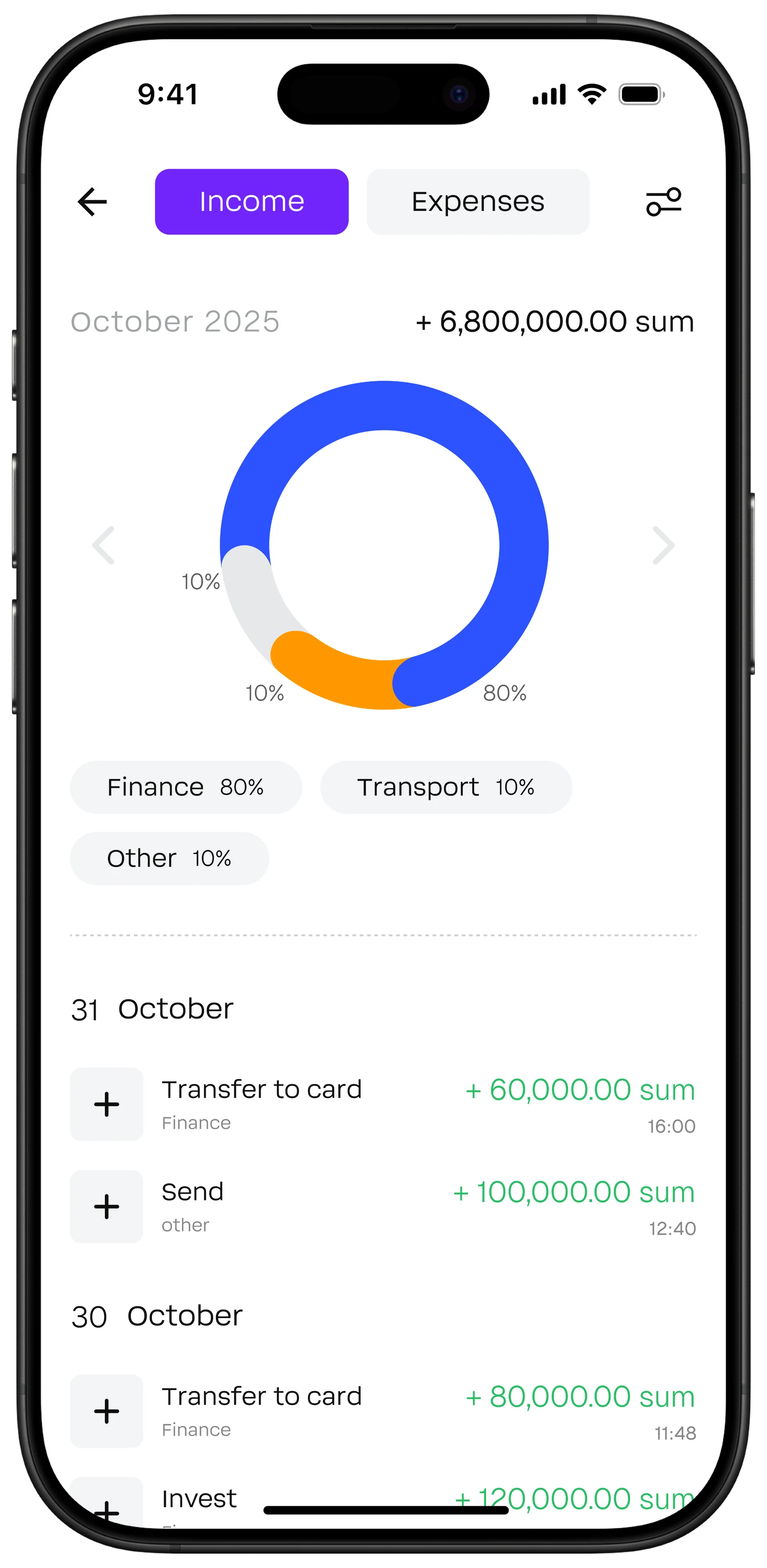
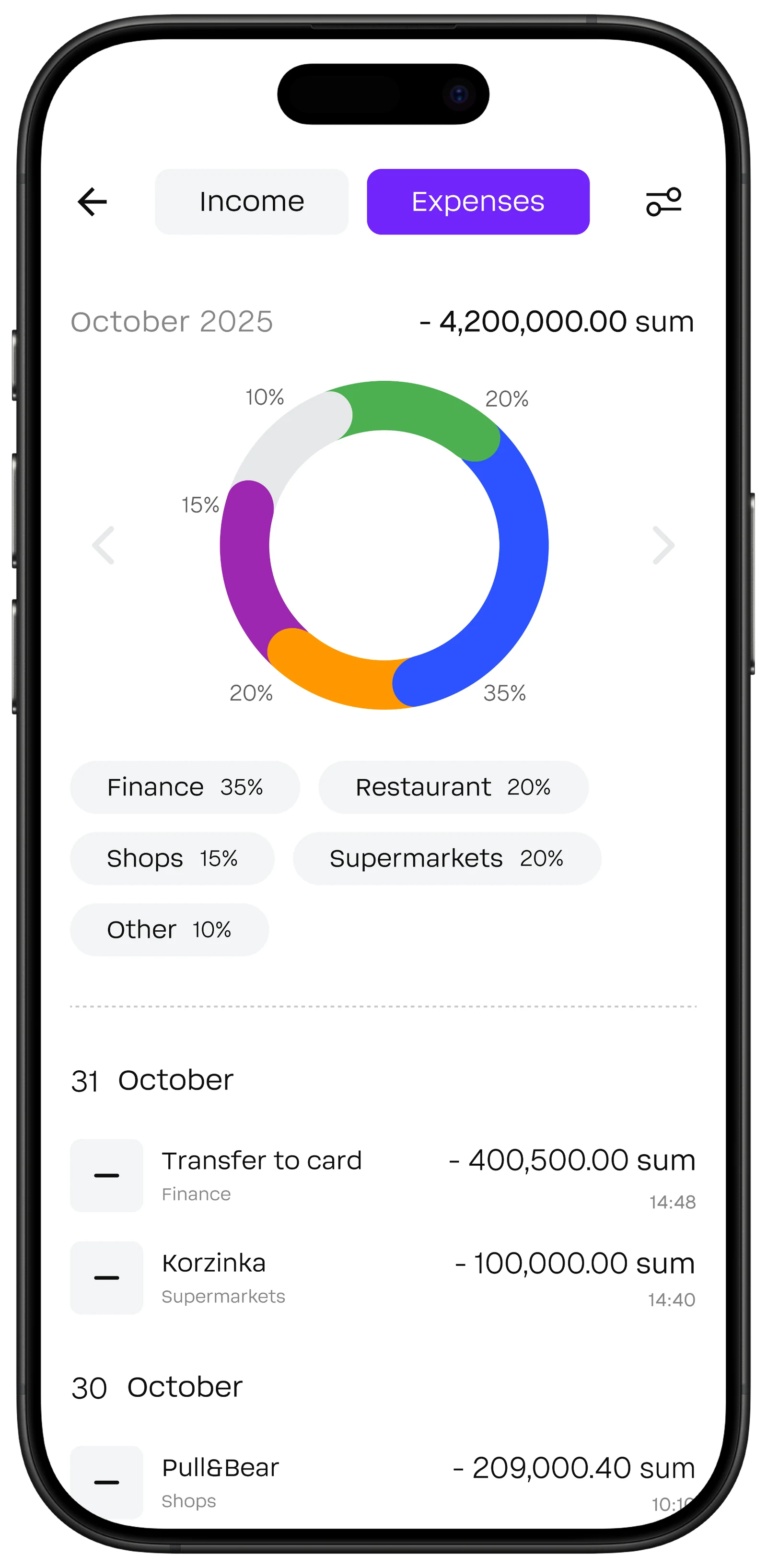
Hypotheses: transaction categories and advanced filter
05 — Result
This project showed me how research changes design decisions. Without interviews, I would have only made “pretty filters.”
The prototype was tested by 3 designers. The main feedback was that filter navigation is clear and the structure is logical.
If the product had launched, I would measure:
— transaction search time — hypothesis: reduction from 2–5 minutes to 30–60 seconds
— % of users applying filters — target of 20–30% of active sessions
— churn to third-party apps (Excel, notes)
In the future, I would add:
spending limits
extended categories
testing with real users